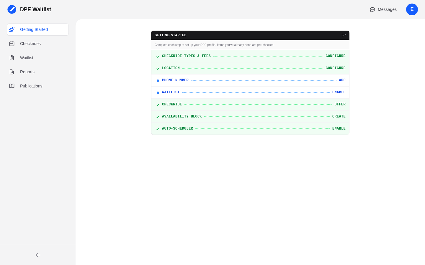
Overview
The DPE dashboard is your command center for managing checkrides, your waitlist, and your schedule. It is organized into three main areas: the top bar, the sidebar, and the main content area. Once you are familiar with the layout, navigating the platform becomes second nature.
The Top Bar
The top bar runs across the top of every page and contains:
- Logo — The DPE Waitlist logo in the top-left corner. Clicking it takes you back to your dashboard home.
- Messages Icon — A mail icon that takes you to your messages inbox. When you have unread messages, a red badge appears on the icon showing the number of unread conversations.
- User Menu — Click your name or avatar in the top-right corner to open a dropdown menu with links to your profile and sign out.
The Sidebar
The sidebar on the left side of the screen is your primary navigation tool. It is collapsible — click the toggle button at the top of the sidebar to collapse it to icons only or expand it to show full labels. The sidebar contains the following sections:
- Checkrides — Your checkride calendar with list, day, week, and month views, showing scheduled, offered, and completed checkrides alongside your availability blocks.
- Waitlist — View and manage applicants waiting for checkrides, reorder priority, and invite new applicants.
- Reports — View checkride statistics and scheduler performance metrics.
- Publications — Access relevant FAA publications and reference materials.
The Main Content Area
The large central area of the dashboard displays the content for whichever section you have selected in the sidebar. For example, clicking Checkrides shows your checkride calendar, while clicking Waitlist shows your applicant queue. The content area adapts to show relevant controls, filters, and data for each section.
Mobile Layout
On mobile devices and smaller screens, the sidebar is replaced by a hamburger menu button in the top bar. Tapping the hamburger icon opens the sidebar as a full-screen overlay, giving you access to the same navigation options. Tap any section to navigate to it, and the overlay closes automatically.